Decorating the tops of cabinets is harder than it sounds. It takes a perfect mix of size, color, shapes, spacing and design. I had a basic plan for the top of our kitchen cabinets as we were building, but you never really know how it will turn out until you’re in the space and trying it out. I decided to tackle the smaller section first, and am quite pleased with how it turned out.

I like my decor to do double duty and actually function, so displaying my large holiday platter was a perfect choice – and the fact that it’s so large it won’t fit anywhere else played a key role too. 🙂 I added the custom cutting board I got for the hubs for a birthday a while back and a two-tier basket filled with faux veggies & fruit for color. All of these things were items I had on hand, so total cost was a big fat $0!
I did have to figure out a way to elevate the items so they could be seen over the lovely crown molding. And the perfect solution came in the form of the little dip cups we’d *cough* “acquired” *cough* from restaurants in our to-go boxes. I was actually about to take the whole stack of them to Goodwill, but as I stood on the ladder contemplating what I could use I had a “light bulb moment” a’la’ Gru in Despicable Me.

I’ve since added the glass chile peppers we found on our honeymoon in Sedona to the left edge of the cutting board for some additional color on that side. I love seeing them displayed and I know they’re “safe” that high up and out of the way. 😉
Next, I had to figure out what to do with the staggered height cabinets on the longer back wall. I already had my giant ceramic chicken my sister gave me and my pretty cake stand, which make a great combo and fit perfectly on one cabinet. I also had my handy drink dispenser on a stand that I’d filled with faux lemons for some color while at the rental house. That too fit perfectly on one cabinet. I still hadn’t spent a dime and I was almost done!


With two cabinets to go, I was stuck. I left the project alone for a few days weeks and moved on to other things. One of those other projects was getting new bar stools for the kitchen island bar, which meant all of our dining chairs moved into the dining room. I didn’t like how full the table felt with all eight chairs around the table so I put two on either side of the buffet. Unfortunately, that meant that the pretty wine rack I’d found during a recent thrifting trip had to find a new home.
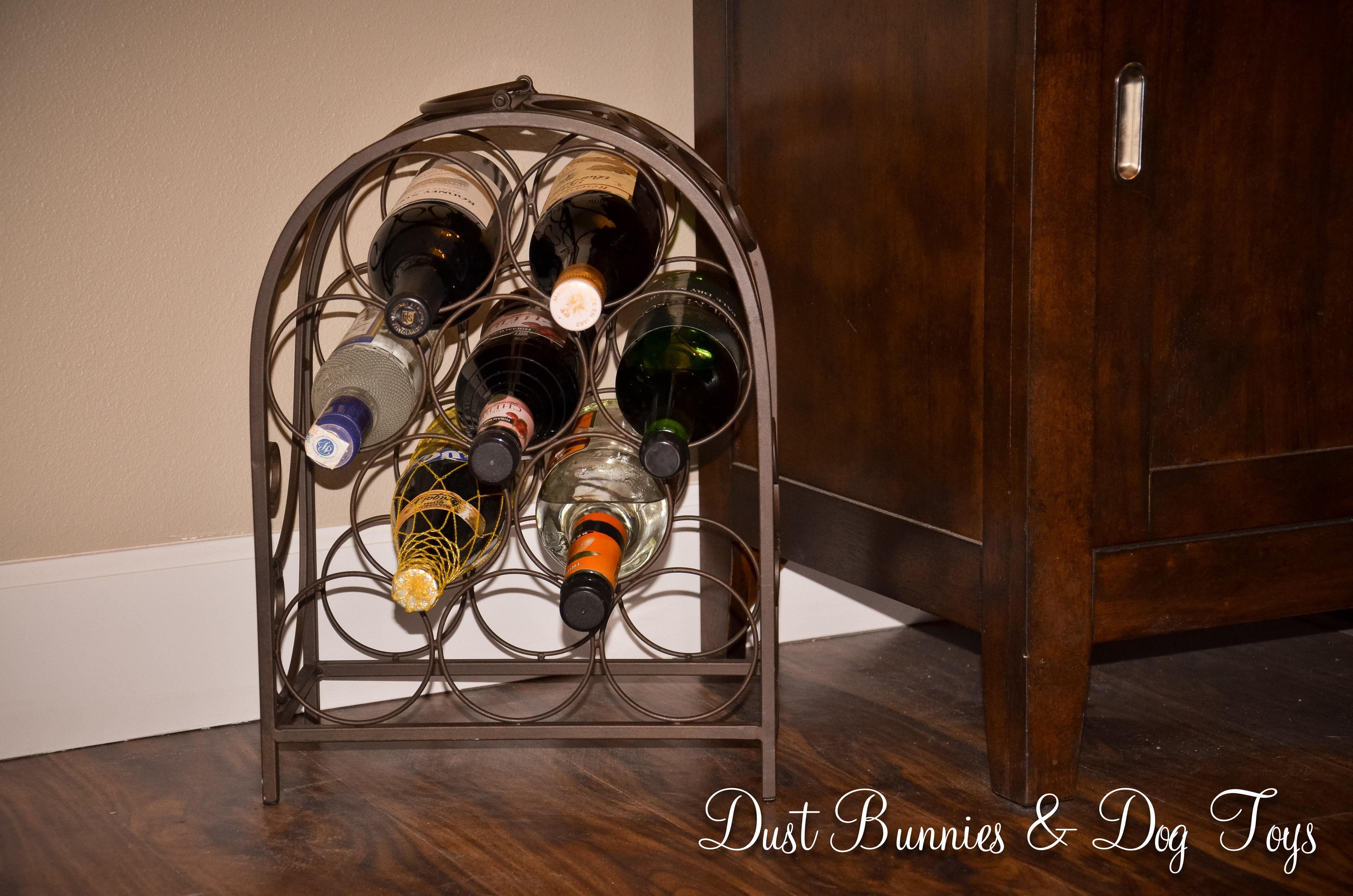
We aren’t big drinkers – even with dogs named after alcohol – so we only had a few bottles of various things (note there is only one real wine bottle in said ‘wine’ rack!) I had originally planned to include some sort of side table or cart as a bar in the dining room or main area of the house, but once we were in and placing furniture it seemed like it would make the space feel crowded and because we don’t tend to keep a lot on hand, there wasn’t the need for a dedicated ‘bar’. So my under $5 rack worked out perfectly and left a little room to expand if needed.

My now displaced rack seemed like a perfect candidate for above the cabinet decor, so I tried it first over the fridge, but it was too tall. The hubs suggested I move the chicken over one cabinet to the spot above the stove and try the rack in the corner. Although the corner cabinet seems to be the same height as the fridge cabinet, they are apparently not, because the rack did fit this time! And I was quite pleased with how it looked in that spot.

Now I’m down to just the space over the fridge. Since this is a wider space I decided to use two items here. First is the lovely vintage scale I bought as a newborn photo prop (even my photography props do double duty!) It hasn’t arrived just yet, but I’m sure it will bring just the right amount of color and difference of shape to that side. I’m a little worried about the scale of the scale (ha ha), but I think it should be ok, even if it’s a little small because I also found a large popcorn tin on a local buy/sell page that I plan to paint. I was originally thinking I’d go with a copper color but now that I have my cache pot, I want something different. Perhaps a milk paint ivory with a greenish lid and a stenciled design similar to this. But before I start that project I want to decide what the design should be. I’m considering a simple ‘Bon Appetit’ but I also like the idea of ‘Delish’ with a small flourish pattern or something using some of these words. Or maybe create something like this but with an Alaskan spin. What do you think would look best? I’m also toying with the idea of changing the handles so it looks a little like the uber expensive Pottery Barn urns I always lust for although Pier 1 has a similar option for a little less.

So far, not counting the scale – since that’s a business expense 😉 – my total is approximately $11 for the wine rack and tin. Not bad at all, if I do say so myself. Granted there might be some cost in painting the tin, but I’m sure it won’t be anything major. I’m sure I’ll do a post on my re-do of the tin once I get to it, so keep an eye out for that!
